Ok I’ll admit to using the startup word as a bit of link bait as this article mainly contains information on branding a new venture, no matter if it is in tech or agriculture, but I hope you’ll find it useful so please stick with it.
My skills come from starting multiple ventures over the course of 20 years. Branding has always been a love of mine since I decided at the age of 13 that I wanted to be a designer. I’m afraid I was a little sad and collected Coca-cola cans and memorabilia – such was my passion for big brands and logos. Fast forward ten years or so and I ended up working in a Design Week Top Ten design agency working on global brands like Nestle, Lego and Vodafone. After four years there, I went out on my own. Running my own agency Dogtooth, I created numerous brands, products, spinoffs and side-projects for myself along the way, and this is where I learned some important things about starting something and creating a brand.
It all starts by naming your ‘thing’. There are numerous conventions for naming companies and products, so I’ll briefly run through the most popular types, in no particular order.
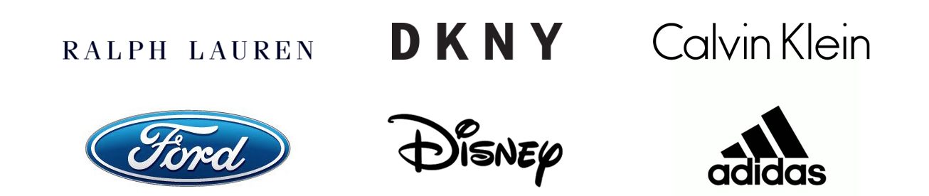
Names – Personal or family names, these tend to be older companies and are used a lot in serious professions like finance and law. Fashion brands often use the designer’s name like Ralph Lauren, DKNY and Calvin Klein. Ford, Disney and Adidas* are also family names.
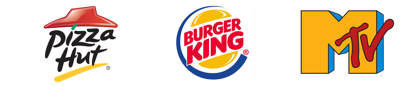
Keywords – Then there is the convention of using a clear keyword in your name to denote what you do, as an example Pizza Hut, Burger King and MTV, there is no mistaking what these companies do.
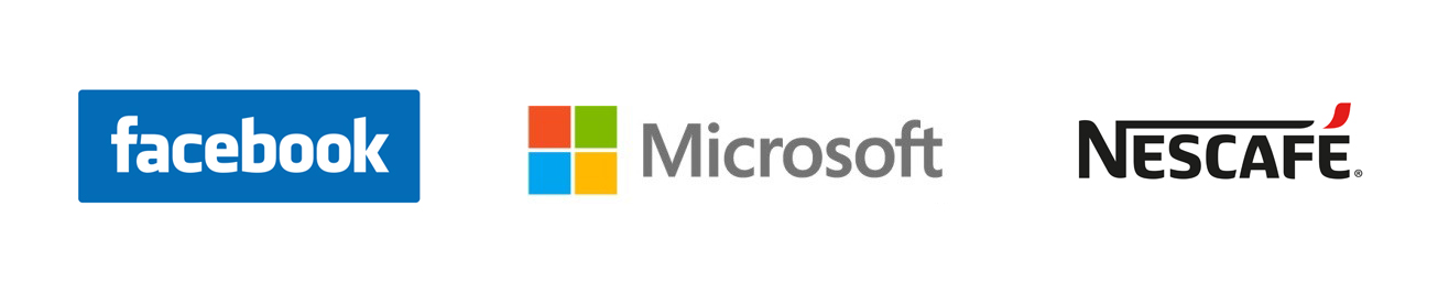
Compound Words – Another naming convention is compound words – two words pushed together to make one new word or name, like Facebook, Microsoft, Walmart or Nescafé.
Words with Meanings – Words with hidden or abstract meanings also feature a lot, for instance we all know Nike is the goddess of victory, but did you know that Amazon.com was going to be Relentless.com (try it), but was changed to Amazon to denote scale, the longest river in the world. Other brands like Apple, Orange and Ikea all have their stories and abstract meanings.
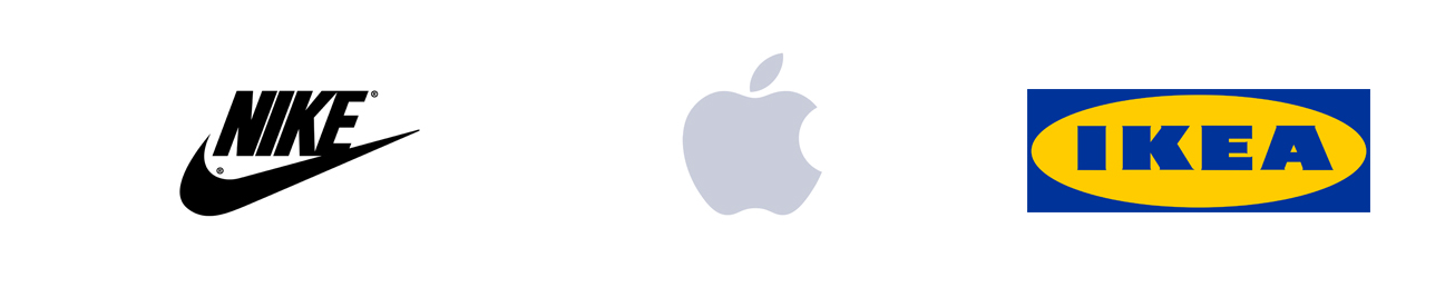
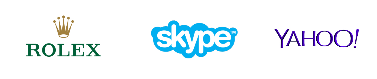
Made-up Words – These can be words that sound like something, for instance Rolex was famously created (made up) to sound luxurious. And similarly there are others like GoPro, eBay and arguably the most famous misspelling to create a word is Google. There are many others, especially in the tech startup world, like Skype and Yahoo.
Logo Design
Once you have your name, then there’s the task of creating a logo. It may be as easy as just typing the word out in your favourite font, like SONY or Panasonic. Or you can include visual elements that we discuss in ‘Icons’ below. Some logos feature visual hidden meanings, like the FedEx arrow between the e and x, CBS eye icon and the Amazon A to Z arrow/smile.
![]()
Colours
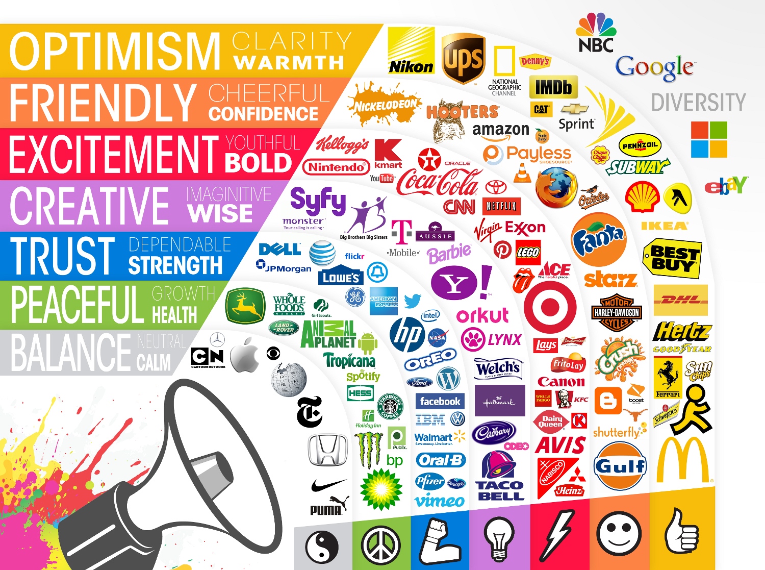
Then there’s colour, a hugely complex issue with links in specific industries and in psychology. Colours are often subjective and can’t be detached from personal perspective, i.e. if blue is your favourite colour, you will have a different experience of blue to someone else whose favourite colour is red. Studies have shown that colour does play a part in purchasing decisions, so you could just choose your favourite colour and ignore all that, but you might be missing a trick.
If you have a fun brand, use red and yellows. If you want to be trusted in finance and law, then maybe use blue or grey. Green is synonymous with natural products and peace. Purple is seen as creative and imaginative.
On the flip side, choosing to use something outside of the convention for your industry could get you noticed. However be careful of the opposite effect, a luxury brand may not work in the cheerful orange, it may do better in silver, gold or black.
Icons
If you look at 80% of the world’s major brands they use pictorial elements. You may want to create something in the logo that actually has a visual meaning for the thing that you do, for instance Burger King has a burger bun around the text and Shopify has a shopping bag icon. In the case of Jaguar cars, Shell Oil, Taco Bell and Pizza Hut they all feature icons or symbols which are based on the abstract element of the name, i.e. the jaguar, shell, bell and the hut, rather than the product.
In a global marketplace, speaking many languages, it is surprising that, though we process pictorial information 60 times faster than text, very few brands chose to use pictorial elements relating to the product they produce and sell.
![]()
Web & Social
Now you have your name, your logo and an icon in the right colours, you need some presence, and where better to start than with the web and social media.
This is where things get tricky, because if you have chosen the name Apple for your Dental Surgery you can guarantee you’ll not be getting the name Apple as a domain name or username on the internet ANYWHERE. So you have to box clever and use other conventions like adding the product to the name for example appledentalcare.com (which already exists) or by adding a suffix or prefix like GETappledentalcare.com or appledentalcareUK.com and many other variations.
Then you have the fact that ‘usernames’ on the big social platforms may have gone already because someone chose it before you. This is tough luck. I know – I’ve tried directly and indirectly to get a username and failed, despite owning the Registered Trademark. So again you have to try the same game with prefixes and suffixes.
What I would absolutely recommend is to spend time to make sure you have your username game aligned. Do not use a hyphen on one site and an underscore on another. If you can get the name you want on one site, but not on another, try again with a different version of the name. I would only use the name you can get on all platforms, (by all means register all you can and use a redirect to your main site) or the one username you have that works consistently over all accounts.
As an example I’ll show you two of my products. I have wallglamour.co.uk (and many other variations around this including .com .org .net) and I use facebook.com/wallglamour twitter.com/wallglamour instagram.com/wallglamour youtube.com/wallglamour etc.
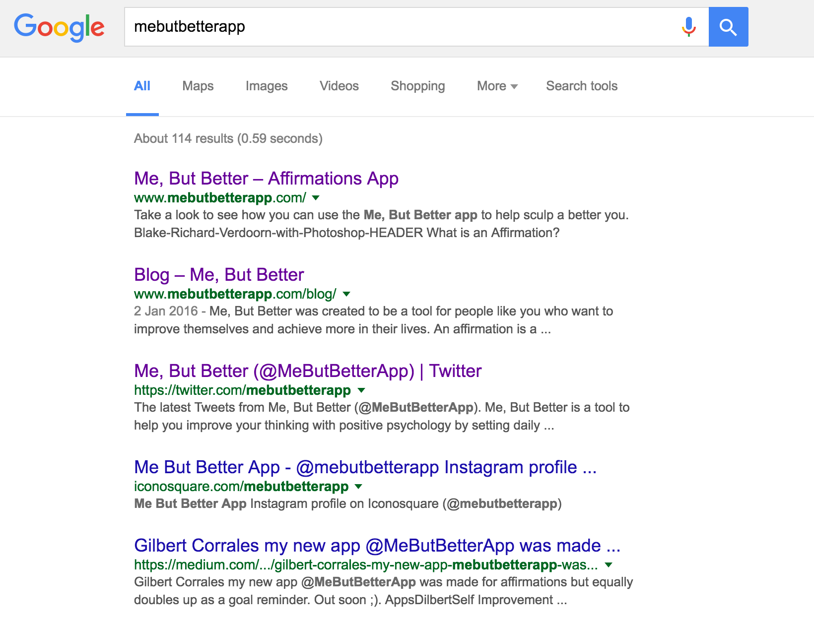
For another of my projects I could not get the name of my App ‘Me But Better’, as MeButBetter.com and MeButBetter on some of the social platforms was already gone. So I opted for MeButBetterApp.com which I also use for facebook.com/mebutbetterapp twitter.com/mebutbetterapp instagram.com/mebutbetterapp youtube.com/mebutbetterapp ensuring if you Google ‘mebutbetterapp’ you will find me, I believe consistency is key.
This also means registering everything going forward with that same name, even if it turns out to be an app or platform that is a flash in the pan. You never know which platform might be the next Snapchat, Twitter or Facebook.
Another little tip on domains names: someone once said to me that owning your niche domains helps to stop your competitors from ranking better than you. So if you have keyword domains in your niche, point them at your brand website. It’s a bit like buying up all the shops on a high street and not letting your competitors steal any sales.
I could write more on this topic, but for now I will give another two top tips.
Tip one: settle on an icon for social media and keep it, do not go changing it regularly if at all. If I go on Twitter and I see the same icons as on Facebook and Instagram I know who I’m dealing with. If you change it or have different ones, I may assume it is another company, a fake account or worst, just plain ignore you. This also goes for personal accounts if you’re a celebrity or head of industry, keep the same headshot so we know it’s you – it will become your icon or logo.
Final tip: in a social media world think ‘square’! By that I mean not landscape or portrait. Most icons for social media are squares or circles so keep your logo readable in a square format. Stack the words on top of each other or try to keep the text bold so it is readable as a small icon. If you can’t do that because your name is long, then your icon needs to do the work. Make the icon strong and obvious and stick with it. In time, whatever it is, it will become associated with your brand through repeated association.
Once you have built a multi-billion dollar business feel free to disregard everything I have just said and do what you like, but until you have the deep pockets to undo a GAP-style logo disaster, the above might help you along.
Finally my disclaimer. A name, a logo and web presence do not make a ‘brand’, but they are the foundation building blocks of one. Without them you may struggle to position yourself for national or global success. If by chance you have a killer product that achieves success without these you will probably be in the minority and I can bet you that you will have to pay a lot more for the domains and usernames at that point. A brand is about much more than the visual assets, it is brand values, customer interactions, team spirit and even the buildings you operate from. Whilst these are crucial to the brand, my skills and interest lie in the visual presentation of a brand, for small or big brands.